January 12
The chronological account of the life of Jan van Krimpen states that he was born upon this day in 1892, that he died on October 20, 1958, and that between these dates he was a typographer specializing in the design of books and was, in addition, a type designer.
When typographers discuss among themselves the types designed in the present century which may be acknowledged to be first rate, two designs are placed at the top of the list, the position of the two being transposed, depending upon individual preference of the typographer. These types are the Centaur of Bruce Rogers and the Lutetia of van Krimpen. The term most frequently used to describe both types is “noble.”
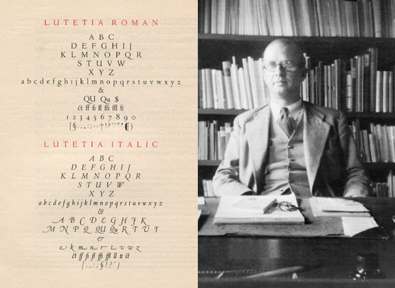
Lutetia was the first type designed by van Krimpen, in his thirty-second year. The designer had prepared for it since his graduation from the Academy of Art at the Hague in 1912, when he was twenty. He became interested in typography soon after his graduation through his reading of The Imprint, a short-lived English periodical which was attempting to improve the quality of English printing, and which contained articles by current authorities on the subject.
In 1923 Dr. Joh. Enschedé of the firm of Joh. Enschedé en Zonen at Haarlem, which had successfully combined typefounding with commercial printing since 1703, asked van Krimpen to consider the design of a new type. Van Krimpen accepted the commission, and the type was completed for use in a book describing Dutch contributions to the International Exhibition of Modern Decorative and Industrial Arts held in Paris in 1925. The designer suggested Lutetia, the ancient name of Paris, for the new letter.
This first type of an unknown designer, in the words of the typographic historian, Stanley Morison, “created something of a sensation.” Emerging at a time when the typefounders appeared to be interested only in display types, a classic roman of regal characteristics was very well received all over the world, particularly by the more traditional printers, who quickly accepted the face as an outstanding entry into the list of fine types. As an italic to complement his roman, van Krimpen created a design patterned on the chancery letters of the early 16th century which has since become one of the most successful types of the genre.
In his other types, Romanée, Romulus, and Spectrum, the Dutch designer continued to investigate the standard roman letterforms, in all instances creating crisp, beautifully formed characters. As an italic for Romulus he experimented with a leaning roman rather than attempting either another chancery or an italic in the style of Robert Granjon. Whether the attempt was brought off successfully depends upon the reader’s viewpoint concerning italic type. Many typographers are of the opinion that a sloped roman letter differs too little from the upright roman to provide the contrast so necessary in modern printing.
Van Krimpen was no exuberant extrovert, but approached type design from a cool intellectual viewpoint.
