Beatrice Warde—Graphic Arts Champion

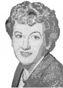
Type portrait of Mrs. Beatrice Warde keyboard-set in type by David Cunningham of the printing department of the Monotype Corp. Ltd., London. This reproduction is much reduced.
“Beware of pinning your typographic heart to a sheet of the calendar. Because when you tear the sheet off, your heart goes into the wastepaper basket. Never, in other words, pin your reputation to any decade, epoch, dawn, or period of time. It is better and far more durable to pin your heart and reputation on something you believe, and know why you believe it.”
A sound bit of advice to the young typographer who is wasting his time looking around for a style upon which he can perhaps build a secure future. And the person who offered the advice, just ten years ago in a New York talk as guest of the Type Directors Club, was Mrs. Beatrice Warde, who died in England on September 14, just one week short of her 69th birthday.
Campaigner for Good Printing
The world of typography can ill afford the loss of one of its most voluble and eloquent champions. With the lecture platform and the printed word, Beatrice Warde has been, for the last 45 years, a relentless campaigner for all that is best in the production of the printed word.
Never shrinking from polemics in defense of her ideals, she naturally enough raised hackles when she espoused the cause of traditional typography against the encroachments of the yahoos of modern design, thereby contributing to the continuing dialogue of traditionalist versus modernist.
It was undoubtedly her own conventional upbringing which contributed most to BW’s adult philosophy. She was the daughter of a composer and musician, Gustave L. Becker, and a great editor and writer, May Lamberton Becker. She was also married to a noted typographer, Frederic Warde (1894–1939).
Following her graduation from Barnard College, she answered an advertisement for assistant librarian in the Typographic Library of the American Type Founders Co. in Jersey City. Her only qualifications for the job were a love for and an interest in books. Of course it was helpful that she carried with her a letter of introduction from America’s most distinguished designer of books, Bruce Rogers.
Henry Lewis Bullen, founder and Librarian of the ATF Library, apparently considered that possession of such a letter gave her competency over the 90 professional librarians who had already applied for the position, as he immediately gave her a duster and told her to go to work.
“I shan’t mind,” he said, “if you stop and read anything that interests you, but take each book off the shelf and dust it.” As the library then contained over 14,000 books, it was apparent that young Beatrice Becker had a long career ahead of her.
Background of a Typographer
“No wonder I became an expert typographer,” she later stated. “For three years there were no visitors at the library and I spent my time reading the books—one of the finest collections of documentary printing in the world.”
That Beatrice Warde acquired astonishing virtuosity as a, typographic historian is evident from her first important published work, under the name of Paul Beaujon, “The ‘Garamond’ Types: A Study of XVI and XVII Century Sources,” which appeared in the fifth volume of The Fleuron, 1926.
In this essay, M. Beaujon presented documented proof that the typeface called Garamond, then in its initial popularity as a revival, had actually been designed some 60 years after Garamond’s death by the French punchcutter and printer, Jean Jannon.
The Garamond paper was so beautifully written that the English Monotype firm asked “M. Beaujon” to come to London as editor of the “Monotype Recorder.” It was with considerable surprise that the company officials learned that the French historian was a young lady from the United States, but she received the position and took up residence in England, returning home just for visits for the remainder of her life.
This Is a Printing Office

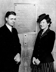
Beatrice Warde with Frank Mortimer beside the bronze plaque of 'This is a Printing Office' at the U.S. Government Printing Office in Washington, D.C.
Probably the most widely disseminated of Beatrice Warde’s writing has been the justly popular piece entitled, “This Is a Printing Office,” which, has been printed in dozens of languages and proudly posted upon the walls of countless printing plants throughout the world.
The most enduring rendition of this impassioned statement is upon the bronze doors of the U.S. Government Printing Office.
Mrs. Warde’s enthusiasm for the printer’s craft was obvious to all who heard her in her numerous lectures. As a vehement promoter of good typography, she visited dozens of countries, talking to students in printing schools and art schools in addition to appearing before professional graphic arts groups.
It was her firm belief that the appreciation for typography and architecture should be taught in all elementary schools, since all their lives people are dependent upon the printed word for information and recreation, and of course live and work in structures built by hand.
The Traditions of Printing
A warm-hearted, generous person, she was at her best before young people, attempting at every opportunity to instill in them her own great admiration for the traditions of fine printing to assure the continuation of these traditions in a world which increasingly aspires to rootlessness.
Several years ago, in an address before students at the Rochester Institute of Technology, she stated. “The most important thing about printing is that it conveys thoughts, ideas, images, from one mind to other minds. This statement is what you might call the front door of the science of typography. Within lie hundreds of rooms; but unless you start by assuming that printing is meant to convey specific and coherent ideas, it is so easy to find yourself in the wrong house.”
On a personal note, I have corresponded with Beatrice Warde for more than 20 years, and I have been privileged to “talk type” with her on several occasions both in this country and at her home base in London. I believe that one of the great rational voices in the service of good printing has been stilled.
It is a loss to us all, possibly putting further away than ever that day when, in the words of Daniel Berkeley Updike, typography, “a broad and humanizing employment, which can indeed be followed merely as a trade. but which if perfected into an art. or even broadened into a profession will perpetually open new horizons to our eyes and new opportunity to our hands.”
This article first appeared in the “Typographically Speaking” column of the November 1969 issue of Printing Impressions.