The Prolific Career Of Morris Benton
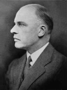
 I recently had the opportunity to read a very fine paper, written by David Ritter of Pittsburgh, on the contribution to American type design by the late Morris Benton. It doesn’t take much reflection to realize that Benton is pretty well forgotten by most printers, although he was unquestionably the most prolific type designer who ever lived.
Beginning in 1900, when he collaborated with his father, Linn Boyd Benton, on the design of Century Expanded for American Type Founders Co., and ending in 1936 when he cut Headline Gothic, he produced a grand total of 199 types, all of which were marketed by ATF. From 1904 Benton turned out at least one type every year and in one single year—1906—reached a high-point of 14.
Many Became Standards
Furthermore, the great majority of these types were not drawn and forgotten, but went on to become standard types in the majority of the nation’s composing rooms. ATF still markets 80 of the Benton designs, and of course most of these are also available on various phototypesetting devices.
A quick glance at the list of Benton types turns up such long-time favorites as the Century series, Franklin Gothic, News Gothic, Alternate Gothic, Bank Gothic, Clearface series (enjoying a strong revival at the moment), and recuttings of such classics as Bodoni, Cloister. Garamond and Bulmer. Undoubtedly there is not a printing office in the United States which does not have Benton types.
Morris Benton’s career as a type designer spanned the exciting years of typographic innovations following the revival of interest in printing as an art and craft at the turn of the century.
This was the period when such figures as Frederic W. Goudy, Bruce Rogers, Daniel B. Updike, and Carl Rollins were building reputable careers. Goudy attained recognition as the foremost American type designer of his time, while Benton remained relatively obscure to most of his contemporaries.
The fact that Benton produced more types than Goudy (123) is not to detract from the accomplishments of the latter, whose contributions were of a different nature. Goudy’s approach to type design while pragmatic in his early years, became increasingly concerned with esthetics.
In addition, he was at the forefront of the private press movement. He loved to meet people and to expound upon his ideas. He was happiest when promoting the concept of printing as an art, either by his writing or in his public appearances.
While Goudy’s early types were advertising styles, he later became interested in book types, particularly those developed upon classic models. He was continually seeking to perfect the roman alphabet, and increasingly lost interest in creating types to meet limited commercial objectives.
A Practical Approach
On the other hand, Morris Benton spent his entire career with a single company. Since it happened to be the leading American type founding firm, interested solely in the production of types which would sell in large quantity, there was little opportunity for any approach other than the practical. And Benton’s temperament was attuned to such a principle.
His father, Linn Boyd Benton, is best known as the inventor of the pantograph device for the cutting of a matrix or a punch. The success of this machine, patented in 1885, freed the typefounder from the dependence upon the hand-cut steel punch. But paradoxically coming at an opportune moment in the development of the typesetting machine, it insured the commercial success of Mergenthaler’s Linotype with its great need for an inexpensive method of punching matrices.
The Bentons at ATF
When most of the typefounders in the United States formed the association called American Type Founders Co. in 1892, L.B. Benton, then owner of the North West Type Foundry in Milwaukee, joined the new organization.
Morris Benton, born in 1872 and educated as an engineer at Cornell, was brought to ATF following his graduation in 1896, to assist in his father in the re-organization of the production facilities. This re-organization was made necessary by the amalgamation of some two dozen separate foundries, with their countless matrices and their great variety of type casting equipment.
In the catalog of the exhibition held in 1947 at the Lakeside Press in Chicago, Benton’s first type is listed as Roycroft, the Elbert Hubbard type (1898). But in the most authoritative compilation of Benton types, that prepared by the late Steve Watts, Roycroft is not listed. Some doubts may be cast on whether Benton could have survived the reputation of having fathered such a letter.
However, in 1900 he did work with his father on a variant of the popular Century type, first cut by the elder Benton for Theodore L. DeVinne and the Century magazine. Century Expanded remains a standard type up to the present time, the first of the dozens of such designs to come from the Benton drawing board.
He was also responsible for the rest of the Century family, including the popular Schoolbook style in 1920. By 1910 over 60 types were successfully introduced from Benton designs, including such perennials as Franklin Gothic, Alternate Gothic, and News Gothic, in addition to the Cheltenham variants.
Adapting the Classics
It was in 1909 that Benton turned to the classic styles, ATF Bodoni being the first successful revival of the Italian masters’ type to be manufactured in this country. This was followed by Cloister Old Style in 1913.
The Golden Type of William Morris was adapted from the types of Nicholas Jenson, the 15th century Venetian printer, but the commercial cuttings which followed the Morris revival, such as Jenson Oldstyle, were ugly types. Benton’s still popular Cloister design was in the general style of Jenson, but represented a great improvement over the Golden Type.
The next classic alphabet was Garamond in 1917, patterned from the Jean Jannon face of 1621 although named for the 16th century French punchcutter. Another revival which achieved instant approval was Bulmer cut in 1928, taken from the fine roman designed by William Martin for William Bulmer’s press about 1790.
And so if went for almost 40 years. Whenever ATF required a modish type to meet a particular demand, Morris Benton was on hand to design it and to assure its rapid production. Types such as Broadway, Card Litho, Hobo, Shadow, Stymie, Typo Upright, and scores more helped the American printer to keep up with the voracious requirements of the typographic marketplace.
It is ironic that in all 199 types, there are none which bear Benton’s name. Actually there was one, produced in 1934, but ATF chose to call it Whitehall. The reason was quite simple. At the foundry, and in all the dealer locations in the various states, type is stored in inventory by alphabetical sequence. Thus it was decided to switch from a “B” to a “W,” as fewer fonts would have to be shifted to make room for the new design.
It is left to record only that Morris Benton died in 1948. Surely he deserves to be more widely known and respected by the craft which he served so faithfully.
This article first appeared in the “Typographically Speaking” column of the April 1971 issue of Printing Impressions.
