Two Were Mentors to 19th Century Typographers
- MacKellar’s The American Printer became a major composing room text
- Harpel’s Typograph by Oscar Harpel was another important book on printing
- Two works were major sources of typographic information until DeVinne
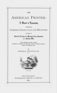
The Civil War centennial year, 1961, is an appropriate time to complete the discussion begun in the December issue. The period 1865–70 witnessed the publication of two books which were the most influential printing texts published in the United States during the entire 19th century. The first of these—The American Printer by Thomas MacKellar—was published in 1866. Within 12 years it had gone through 10 printings and 10,000 copies. Writing in the pages of The Inland Printer over a half century ago, Henry Lewis Bullen, the late typographic historian, stated that there was a time when every printer who was a real printer owned a copy of the book.
Some controversy exists over the total number of printings made before The American Printer went out of print, but 18 would be a reasonable estimate. This indicates that the text had led a useful life of over 30 years before it was replaced by T.L. DeVinne’s Practice of Typography. Today, of course, MacKellar is a must for everyone interested in 19th century American composing rooms.
✶
Thomas MacKellar of Philadelphia, the author of this manual of typography, was one of the great figures in the history of printing in the United States. Bullen places him with Franklin and DeVinne as the “big three,” but this judgment appears to be somewhat generous. MacKellar’s influence on the craft, however, was considerable, and he should certainly be ranked with DeVinne as the most influential printer of his own period.
Born in 1813 in New York City, MacKellar stood before his first case of type at the age of 13, although his actual indentures did not begin until he was 14. When he retired from business in 1885 he wrote a descriptive paragraph of that occasion which probably best expresses the idealism of the period:
“On the first day of May, 1826, we set our initial stickful of types, followed by three more on the same day, all in brevier, besides laying a font of job type. It was our first day in any printing-office, and a high day it was, for we believe we leaped deerlike over every housestep and cellar door on our way homeward at dark.”
In 1829 MacKellar was employed as a proofreader for Harper & Bros. When he was 21 years of age, he became head proofreader for the firm of Johnson & Smith in Philadelphia. A short time later he was appointed to head the stereotyping and composing departments of the company.
At the time MacKellar joined the Johnson organization, it had just acquired the famous old letter foundry of Binny & Ronaldson, thus adding type founding to a successful stereotyping business. The company became a most influential force in American typography until it was absorbed in 1892 by the American Type Founders Co.
In 1845 MacKellar was made a partner of Johnson & Co. In 1867 the firm became MacKellar, Smiths & Jordan.
It was during the period in which he managed the type foundry that MacKellar most influenced his fellow printers. As editor of the foundry’s own journal, Typographic Advertiser, his continuing search for perfection brought to the craft a keenness for and an awareness of new methods and procedures. It was after 11years of editing that MacKellar assembled in the pages of his American Printer his ideas for updating the performance of the printing trade.
This manual depended, as did its American predecessors, Typographia by Thomas H. Adams (1837) and The Printers’ Guide by C. S. Van Winkle (1818), upon the English printer’s manuals of Moxon and of those who followed him after 1683. Whereas Adams copied from all the rest without acknowledgment, MacKellar stated in his preface that he used earlier books.
It is doubtful that composing room apprentices today would be interested in the methods suggested by The American Printer. The author asks of a lad who proposes to learn the art and mystery of printing: Have you had a fair common-school education? Are you a perfect speller? Have you a turn for reading? Is your eyesight good? Are you under 15 years of age?
“A true affirmative answer to all these queries,” he states, “will entitle him to the position of reading and errand boy. He is told the hours at which he is to come and go, and a strict punctuality is enjoined upon him. He sweeps the room,—he sorts out the pi,—he learns the position of the various letters in the case. A year spent in this way is an excellent preparative for ‘going to case,’ or learning the art of composing type.”
That printers found his instruction useful is borne out by the success of the book. While not to be compared in originality with DeVinne’s later four-volume manual, the MacKellar treatise was rightly considered to be a most valuable tool in many American printing offices of 75 to 100 years ago.
For his many contributions to his craft, MacKelIar received one of the few honorary degrees of Doctor of Philosophy ever granted to a practical printer. It was bestowed by Ohio’s Wooster College.
✶
The second most influential book published in the period following the end of the Civil War was Harpel’s Typograph, which was written, set, printed. and published in Cincinnati in 1870 by Oscar Harpel.
While it presents a number of pages which describe the everyday operation of a printing office, it is most important as a specimen book. It was Harpel’s idea, though, to present the types in use rather than simply by font. It is this feature which prompted Henry L. Bullen to call it “a landmark of value in the history of American printing.”
Without doubt, here is the most representative book of the decorative typography which we associate with the last half of the 19th century. American type founders were beginning to break away from the dependence upon European foundries, and the compositors were using the types with imagination and vigor. Harpel’s Typograph preceded a few years the era when “rule bending” was the over-all passion, but in these pages, every facet of “job printing” was explored from calling cards to posters, and billheads to broadsides. Harpel printed them all meticulously, using up to five colors.
All of the samples shown by Harpel are from normal jobs produced for customers and are not merely show pieces planned for a specimen book. Typographers today can only marvel at the ingenuity of the comp. of the 1860’s, who was most anxious to have the opportunity to demonstrate his efficiency and skill. His pride of craft is perhaps exemplified by the last paragraph of Harpel’s introduction in his Typograph:
“In conclusion, the desire is earnestly expressed that the Typograph may aid to inaugurate a better understanding of the tasteful utility as well as artistic scope of typography in the present day. It is hoped, moreover, that a kindly disposition of emulation, communication, and comparison will spread among the junior and senior members of the honorable craft. Such a spirit, if properly maintained, can only promote the interests of all concerned, and serve to elevate Printing still higher as a substantial, and creative Art.”
This article first appeared in “The Composing Room” column of the January 1961 issue of PRINTER and LITHOGRAPHER.

