When a Student Designs a Typeface
Writing about his profession of type design some 35 years ago, Frederic W. Goudy stated:
“Critics, unfamiliar with the classic forms of the past, too frequently mistake details of handling for the essentials of underlying structure, rating highly one design exhibiting some more or less insignificant but flamboyant touch—and rating as mediocre another, of less radical handling, because subtleties less obvious, that have resulted in a distinctly new expression, are wholly unperceived.
“The fusion of type forms of today with the classic forms of the past can come only from the artist familiar with the work of the scribes and the best of the early types. Such an artist may fuse two traditional forms into one and produce a new letter in which the rhythm and artistic value of both are retained, yet presenting an entirely new expression.
“If I may interpolate here a purely personal note, I would say, speaking as the designer of many types, that while my mind is consciously set on departures in design, I am always aware that fundamentally my type forms must be bounded strictly by tradition.
“I do not feel that it is ever necessary to break with tradition in order to secure freedom from rigidity or formalism. In a spirit of abject humility almost akin to fear, I attempt always to stamp with my own personality every new font I essay, and each, at that moment, marks the culmination of my esthetic and artistic aims.”
A Type of His Own
Mike Bixler, 21 years of age, of Easton, Pa., a student just completing his fourth year in the School of Printing of Rochester Institute of Technology, may not have run across these particular paragraphs of Goudy’s. But he has made himself sufficiently familiar with the career of the great American type designer that he has unconsciously followed a similar credo. Mike Bixler, in fact, has become so interested in printing types and their use that he has designed his own type, which he expects to use in his own press.
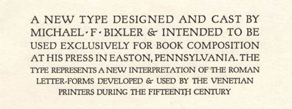
The Bixler font is probably the first ever to be designed and cast in an American college and constitutes a remarkable achievement on the part of its youthful creator. It has been cut in two sizes—an 18-point cap font, and a 14-point complete font. Both sizes have been cast on a Thompson Type Caster for hand composition.
In his first proof of the new type, the designer states that it “represents a new interpretation of the Roman letterforms developed and used by the Venetian printers during the fifteenth century.”
In this respect he is following the pattern of Goudy’s many attempts to improve upon this historic original. Goudy never tired of experimenting with the classic letters produced in Italy during the period 1465–1500. Many of his best types, such as Forum, Goudy Old Style, Deepdene, Goudy New Style, Village, and Californian, are the result of his search for the “subtleties” quoted earlier.
Primarily for Books
Bixler Roman, as we shall have to call this at-present unnamed type, has been designed primarily for the setting of books, its designer being not so much excited about type design per se, as about having a personal type with which to print. It is a solidly constructed roman letter of almost semibold weight.
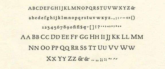
From the evidence of the first proof—solidly impressed, incidentally, in Curtis rag paper—it appears to lend itself ideally to the kind of page Bixler likes to produce, in the tradition of the best private presses, whose work Bixler has studied carefully. Typographers will note that some of the letters have Goudy touches, particularly the “A,” “V,” and “W.”
Bixler drew his letters to a 7″ size, and sent the drawings to a Japanese matrix manufacturer, who engraved a pattern plate of each character from which was produced a matrix for use in the Thompson machine. The Japanese matrices are beautifully finished, and have the further advantage of being relatively inexpensive compared with matrices produced in the United States.
At present the type is happiest in the construction of the capitals. There is much further work to be done with the lowercase font in the fitting of a number of the characters, and in the basic form of some of the letters such as the “t.” But this is of course to be expected in any new type, particularly one designed for continuous reading.
As fine a designer as William A. Dwiggins, in his letter to Rudolph Ruzicka concerning the design of a book type, mentioned his frustrations about fitting.
“Each type-letter,” he wrote, “wherever it goes, carries along with it two fixed blank spaces, one on each side. And, of course, each one of the 26 is likely to be placed alongside any one of the other 25 with their fixed blank spaces. So the odds against you in the fitting game would seem to be 2074 to 1. (Would it be that, or 2500 to 1?)”
Knowledge Gained
So the young type designer is not discouraged. He plans to go back to the drawing board armed with the knowledge of what he has learned the first time through. He is mostly excited at the prospect of producing his first book set in the new type. In his home printing office he has a Kelly C press upon which he has printed several beautiful examples of the printer’s craft, set in the American Uncial of the late Victor Hammer.
When Mike Bixler first came to Rochester Institute of Technology, he paid a visit to the Frederic W. Goudy—Howard W. Coggeshall Memorial Workshop, which contains one of the finest and the most readily available collections of the work of Frederic Goudy. He very quickly became a Goudy enthusiast, going through the school’s library of Goudy memorabilia and carefully examining the many fonts of “lost” Goudy types in the workshop.
During his second year Bixler became acquainted with the work of Victor Hammer, who was then in the last year of his life. Purchasing a number of fonts of the American Uncial, Bixler turned out a splendid Christmas keepsake in the Hammer spirit. In December 1967, he was invited to visit Mrs. Carolyn Reading Hammer, who is continuing the Hammer private press in Lexington, Ky. Mrs. Hammer was extremely enthusiastic about the young printer’s traditional skills, introducing him to Thomas Merton, the Trappist monk, for whom he has already produced a keepsake.
For the last two summers Bixler has worked as a production assistant for a New York publisher, a job which allows him the opportunity to visit the fine New York libraries, such as the Morgan and the Grolier Club; and of course, the proximity of many rare book establishments is most desirable.
He has no plans to be a type designer. He realizes he would be severely limiting his future, since most contemporary type designers are more actively engaged in typography than in the creation of new fonts of type. Probably he will head toward the establishment of his own press in which he can actively control every aspect of production, in the spirit of such fine American printers as the Grabhorns of San Francisco and Joseph Blumenthal of the Spiral Press in New York. Whatever he sets out to do, American printing will be the better for it.

