Anatomy of a Type—2: Garamond
The types which presently bear the name of the great French punchcutter of the 16th century, Claude Garamond, are universal demand, and are thus available from a variety of sources, including foundries and composing machine manufacturers. Unfortunately, the many versions do not always have the same characteristics, a factor which makes there ready identification difficult.
The Garamond types have a rich and interesting history, an understanding of which will simplify the problems of recognition encountered by printers confused by their names and styles.
Those who wish to delve more deeply into origins than the space of this article allows, are devised to consult the most of your data source in the English language, The Garamond Types by Paul Beaujon, which appeared in Volume V of the English typographical journal, The Fleuron, 1926.
Claude Garamond was a notable engraver of punches during the middle years of the 16th century, making his reputation with a font of Greek, on the strength of which he became probably the first successful independent punchcutter, a craft which had heretofore been one of the skills practiced within a routing office.
Garamond, a pupil of Geofroy Tory, first Royal printer of France, no doubt was influenced in his design of a roman font by the immensely popular types which issued from the Venetian office of Aldus Manutius about 1549–99, and which had been widely pirated by French printers in Lyons.
Of particular interest was the addition of De Aetna by Pietro Bembo, containing the lovely roman type cut by Francesco Griffo, punchcutter for Aldus. Tory also owned a copy of the magnificently printed Aldine volume Hypnerotomachia Poliphili, another source of inspiration to a designer of roman types.
Upon Garamond’s death in 1561, his punches and matrices were sold, a principal purchaser being Christopher Plantin, whose printing office in Antwerp was to become the finest in Europe before the end of the century. At the Plantin-Moretus Museum in Antwerp, typographic experts have been making considerable headway in the cataloging of the thousands of punches and matrices in its possession. Aided by a system of identification developed by a young American, Mike Parker, now with Mergenthaler Linotype Company, it has been established that seven of the historic fonts are attributable to Claude Garamond.
In 1592 the Frankfurt typefoundry of Egenolff-Berner issued a monumental specimen sheet, the first to come from any founder. It contains several fonts which have also been ascribed to Garamond. There appears to be doubt whether or not these punches were acquired from Garamond’s widow or were brought to Frankfurt by a punchcutter named Jacques Sabon, who had helped Plantin in the establishment of the Antwerp foundry.
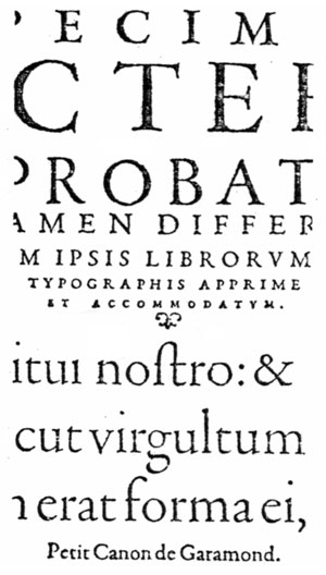
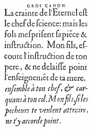
Whatever the explanation, the Egenolff-Berner casting helped to establish the Garamond designs as the principal roman types used by European printers. This 1592 specimen, which contains italics designed by Robert Granjon, has been the source for several of the contemporary cuttings of the Garamond style.
Another important derivation of the present-day Garamonds is the type which was cut by the French printer Jean Jannon and was first shown in his specimen sheet dated 1621. Jannon, who was a printer to the Protestant academy at Sedan, was unfortunate in his period, his typefoundry materials were confiscated by the King’s forces at the instigation of Cardinal Richelieu and placed under the care of the newly formed Imprimerie Nationale, or royal printing office. This establishment, founded under Richelieu’s direction, is still in existence. The Jannon types were used in the Cardinal’s memoirs, printed in 1642.
The Jannon types, cut some 60 years following the death of Claude Garamond, contain many characteristics which are obviously patterned from the designs of the 16th century punchcutter. As M. Beaujon points out, however, the angle of the serifs of such letters as m, n, p, and r is, in the Jannon model, much greater than in the Garamond.
Obviously Jannon, while influenced by Garamond, did exercise his artistic prerogative to differ in a number of individual features. The result is that his type is a continuation of the process initiated during the Venetian period when the punch cutter began to free himself from the dependence upon the pen-drawn letters of the writing master.
As the style represented by the Jannon design then lost favor, the types were completely forgotten for over 200 years, when they were “discovered” in the vaults of the national printing office and were attributed not to their designer but to Claude Garamond. Printed in the specimen of the historic types owned by the office, in 1845, the Jannon types were not used again until they were revived by Arthur Christian, director of the French National Printing Office, for use in a splendid history of French printing, written by Anatole Claudin.
This volume, called by Daniel Berkeley Updike, “probably the finest book on printing that has ever been published,” brought international renown to the caractères de l’Université, as the type was known. By decree, the French government forbade the copying of the design, but such an authoritative decision was not of course binding upon typefounders in other countries.
Twenty-five years later there were a number of types available on the name of Garamond. It was not until 1926, however, that Paul Beaujon’s researches brought to light the important fact that the caractères de l’Université were from Jannon’s hand and were not truly Garamond types at all, notwithstanding the many apparent resemblances.
In the meantime several of the re-cuttings were patterned from the 1592 specimen of the Egenolff-Berner foundry and were thus “true” copies of the original 16th century Garamond types.
Next month I will review the versions of Garamond which are currently available.
This article first appeared in the “Typographically Speaking” column of the May 1967 issue of Printing Impressions.

