Bodoni–the Anatomy of a Type, Part I
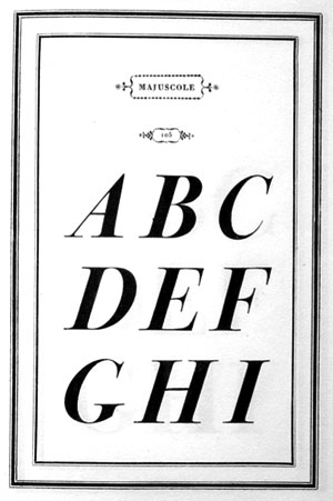
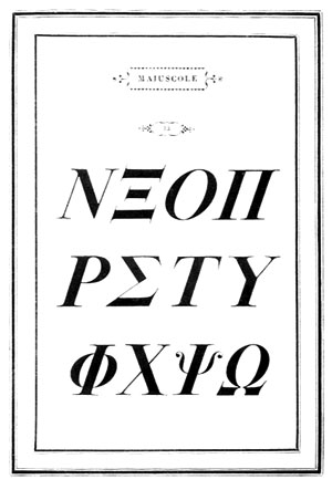
The numerous types which today bear the name of Bodoni or attribute more to his skill as a printer then to his ability as an engraver of punches. Most of these types may be considered to be in the style of Bodoni rather than exact copies of his letterforms. They do, however, represent the ultimate development of roman characters as expressed in printers’ types, carrying forward the interpretations begun by the Venetian Nicolas Jenson in 1470 and continued through a 300-year period.
During his long period, the stamp of national characteristics modify the original humanist style. Garamond in France in the 16th century, the Dutch type founders in the 17th century, an Englishmen William Caslon and John Baskerville in the 18th century, all contributed to the ideal of perfection which Giambattista Bodoni was to bring to full fruition.
In fact, it was Baskerville who made the immediate impact which was to result in Bodoni’s becoming the most widely admired printer of his time and in his being remembered as one of the finest in the history of the craft.
Learned Printing as a Boy
Giambattista Bodoni was born in Saluzzo, Italy in 1740. As a boy, he learned the art from his printer-father, developing skill in the cutting of wood blocks. At 18 he became a compositor in the Vatican printing office in Rome. This office possessed a notable collection of types for printing most of the world’s languages.
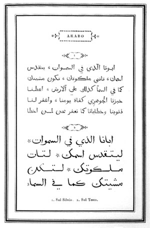
Bodoni studied the Oriental languages and was assigned the task of cataloguing the exotic characters which had originally been cut by Garamond and Le Be over a hundred years earlier and which were then in a state of pi. It was this assignment which excited his interest in the cutting of punches. It resulted in the design of several ornaments which received favorable comments from his fellow compositors at the Vatican office.
After serving in Rome for ten years, Bodoni decided to travel to England, in the hope of visiting Baskerville. Baskerville’s methods of printing were greatly admired on the continent of Europe, although received with diffidence by English printers.
It was at the very start of this journey that Bodoni became ill at his home in Saluzzo. During the period of his recovery he was sought out by the Duke of Parma. The Duke, having founded a library and an academy of art, wished to establish a printing office in the manner of other royal houses in Europe. Bodoni accepted the Duke’s offer to become director of this press. In February 1768 he arrived in Parma to begin the accumulation of materials necessary for printing office.
Decline in Typography
The typographical aspects of book printing had been in decline during the earlier years of the 18th century. Bibliophiles were most interested in engraved illustration and ornaments, the success of a book being judged by these factors. With all the attention being centered upon engravings, printers have become very lax about the selection of type and the quality of press work was at a low ebb. Bodoni was to change this viewpoint radically.
For his first types he turned to those cast by Pierre Fournier in France, with which he produced his first half-dozen books. His adoration for Fournier is evident in the first specimen book produced by Bodoni in 1771, which copied almost intact the ornamental title pages of Fourier as expressed in Manuele Typographique.
But the Italian printer soon began to break away from his dependence on Fournier and attempted to improve the style, with the establishment of his own foundry as an adjunct to the printing office.
The types of Fournier undoubtedly owe their inspiration to the fonts ordered by Louis XIV for the Imprimerie Royale in 1692 and called the romain du roi. A Royal commission was appointed to create a new series of types. The punchcutter Philippe Grandjean was selected to work with the commission.
The romain du roi represents the earliest attempt to create a type for a special purpose, combining precise proportion with beauty and legibility. It was immediately criticized as being a mechanical rendition rather than an esthetic one, but in retrospect it was the pioneer type in the classification now called modern.
Although it became the property of the French government, the type had a considerable influence upon 18th century typefounders. The contribution of Bodoni was too perfect the style and he produce magnificent rating utilizing these new letterforms.
Bodoni’s ideas as a printer and as a punchcutter are best expressed in his own words. In the preface to his splendid Manuale Tipografico, published posthumously by his widow, he writes: “It is proper here to offer the four different heads under which it seems to me are derived the beauties of type, and the first of these is regularity–conformity without ambiguity, variety without dissonance, and the quality and symmetry without confusion. A second and not minor value is to be gained from sharpness and definition, neatness and finish. From the perfection of the punches in the beginning comes the polish of the well-cast letter which should shine like a mirror on its face.”
Two Periods of Bodoni
Updike speaks of Bodoni as having two periods. In the first reprinted with oldstyle or transitional types with the addition of numerous ornaments; in the second he “depended on his own types and unadorned typography for his effects.”
This latter, or 19th century style, Updike deplored, calling it “as official as a coronation and as cold as the neighboring Alps!” Is this later period, however, which may truly be considered as representing Bodoni’s great contribution to typography, since it was such a radical departure from the earlier traditions.
Bodoni wrote of “the beautiful contrast as between light and shade which comes naturally from any writing done with a well-cut pen held properly in the hand.”
The pen referred to is no doubt the chisel-pointed pen of his period rather than the broad-pen which had influenced the oldstyle types. Bodoni thus created his letters in the crisp contrasts of the engraving styles which were so popular in his day.
To be concluded next month. . . .
This article first appeared in the “Typographically Speaking” column of the July 1968 issue of Printing Impressions.


