Typography Exhibits Best of Canadian Printing

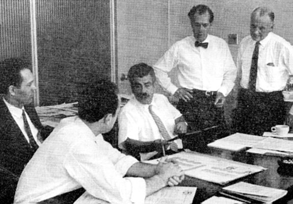
Carl Dair (c.) discusses entries with (l. to r.) judges Gerard Caron and Ernst Roch, and codirectors Gerry Moses and Leo Consedine.
The Best in Canadian typography during the past year has been selected by a panel of experts for Typography 61, the fourth annual competition of its kind. Winners will be exhibited Sept. 20–Oct. 8 at the Royal Ontario Museum in Toronto, and from Oct. 23–Nov. 12 at the Museum of Fine Arts in Montreal.
The competition is divided into book design, printing for commerce (annual reports, letterheads, brochures, etc.), and magazine and newspaper design. It is sponsored jointly by the Society of Typographic Designers of Canada and the Rolland Paper Co., Ltd.
Frank Davies, editorial art director of Maclean-Hunter Publishing Co., Toronto, who, with Allan Fleming of Toronto and Frank Lipari of Montreal, judged the books category, found encouragement in the rising quality of Canadian books.
“There are some wonderful books in the show,” he said, “which are as good as any books produced anywhere in recent years.” He noted that he and his fellow judges were virtually unanimous in their selections.
Leslie Smart of Toronto, who judged printing for commerce with Franklyn Smith, also of Toronto, and Gilles Robert of Montreal, also was encouraged.
“While there was little indication of any violent revolution in design in these areas,” he commented, “there has been a strong upsurge in general standards.”
Mr. Smart had mixed feelings about the annual reports. Some, he observed, had “a tendency to go overboard and be too lavish; those working on obviously smaller budgets tended to be cleaner in design and thus more acceptable.”
The printing for commerce judges were enthusiastic about letterheads—”a startling improvement throughout,” Mr. Smart noted.
In respect to advertisements, however, he was “disappointed.” And catalogs had a tendency to be “too busy, attempting to glamorize rather than be a functional reference, which, after all, is what they should be.”
As in the 1960 competitions, Canadian newspapers and magazines found little favor with the judges. Carl Dair of Toronto, who with Ernst Roch and Gerard Caron, both of Montreal, judged this category, found it “discouraging to find precious little of the freshness of typographic approach that has come into the commercial field and the book field.”
“It would appear,” he said, “that what has been called the typographic revolution has still to hit our periodical and newspaper publishers.”
“Formulas which have been used for 20 or 30 years still dominate the newspaper pages submitted; trade magazines were dominated by obsolete type faces and careless setting. In the field of company magazines, where more liberal budgets might be expected to lead to more imaginative treatment, only a few utilized the opportunities to the full,” according to Mr. Dair.
This article first appeared in the September 1961 issue of The Inland Printer/American Lithographer. Although uncredited, it is most likely written by Alexander S. Lawson.