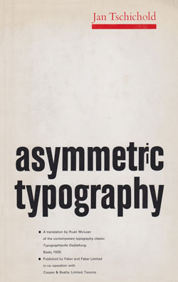
Asymmetric Typography
 “Typography is the arranging of words to be read. Before the words can be arranged they must be understood. The typographer must first read through the manuscript and understand. Until he has done so, he will not know what it is all about. The intelligent arrangement of the words is the first duty of the typographer. Equally important is the job’s appearance—a good typographer must know how to make the text easiest for the reader’s eyes. He has not, however, unlimited freedom; some limitations are imposed upon design by the techniques of printing. Technical integrity is just as important in designing for print as an understanding of the contents and skill in making them readable.”
The above question, rational enough to be satisfactory to the most traditional typographer steeped in the lore of the English private press movement and its adherents, is taken from a book which has long been a veritable bible to the avant-garde designers since its publication in 1935 under the title of Typographische Gestaltung.
Perhaps its unavailability in English translation until this year has contributed to its unique position as a key work in the literature of modern typographic design, since it is now obvious that many of its advocates had not even read it.
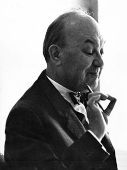
Fortunately the book has now been published, most ably translated by Ruari McLean, an English printer and historian. Asymmetric Typography represents what might be termed the second thoughts of its distinguished author, Jan Tschichold, following as it did by seven years the publication of his first book, Die Neue Typographie, in which he took up the cause for a “modern” typography represented by the then (1928) new geometric sans serif type.
Change of Mind
Since publishing this immensely popular treatise, Tschichold has recanted his youthful indiscretions concerning typography, much to the dismay of the powerful coterie of designers who utilize the ideas expressed in the book as the gospel of modernism. Tschichold is unconcerned about his fall from grace, having become a classical typographer of note during the last 30 years.
It is surprising that Asymmetric Typography has receive the adulation of the modernists for so long, as it contains a great deal of extremely traditional advice about type handling. Possibly the illustrations serve the purpose, instead of a close reading of the text.
Tschichold expresses annoyance, for example, with the then current habit of crowding lowercase letters, a practice which is again popular in advertising typography.
“The correctly set word is the starting point of all typography,” he wrote. “The relationship of the letters is the job of the dresser in the foundry. He has to achieve the right regularity and rhythm and his work is as important as the engraver’s. Many good types have been spoiled by type dressing. This forces the compositor to make good the larger sizes with letter spaces. Apart from this, letterspacing is always harmful.”
In the matter of using sans serif type, Tschichold in 1935 advocated the form “as by far the best all-purpose type for today and will remain so for a long time to come.”
Looking back upon that statement, he now pleads, “Very often error is creative. My errors were more fertile than I ever imagined. . . . It was a juvenile opinion to consider the sans serif as the most suitable or even the most contemporary type face. A type face has first to be legible, or rather readable; and a sans serif is certainly not the most legible type face when set in quantity, let alone readable.”
Purpose in Design
The primary purpose of this little book is to make typographic designers aware of their responsibilities in the presentation of print, and Tschichold loses no opportunity to point this out. While he was appealing to his readers to disregard the static arrangements of the “old typography,” he was nevertheless asking that they respect fitness for purpose.
“Successful design,” he stated, “a visual or esthetic creation, is an in-product imprinting, not the realization of an external design-concept.”

In his instructions for the selection of type and for the mixing of type styles, Tschichold suggested that the sizes of type in any one job be limited and that full use being made of the variations of a single design before turning to another style.
Sizes should be clearly different to be effective, and care should be exercised to suit the display type to the character of the job. He believed that shaded and three-dimensional types destroyed the two-dimensional nature of typography.
Designers who use the asymmetric form naturally enough tend to break away from traditionally justified lines. Tschichold cautions them not to use a flush right style, since this treatment runs counter to reading habits by which the eye is most comfortable returning to the same position to start a new line.
Tschichold’s asymmetric typography is always rational. He makes no attempt to seek difference for its own sake, attempting instead to use contrasts as the “basis of all modern designing.” Both in the text and by his illustrations the author points to simplicity as a positive answer to design problems. Certainly he expostulates the need for discipline and order.
The young designer looking for open sanction to get away with anything that is different or find little to comfort him in this book. While it expounds a philosophy which sometimes seems to run counter to that of traditional typographers, it nevertheless encompasses a great many concepts which are both reasonable and agreeable.
Certainly, the conventional designers will agree with the writer’s statement that “only typography whose arrangement is clear, whose appearance is pleasing and whose production is technically faultless, can be called art. Every skill implies an art; only in the sense is the word ‛art’ used. The art of photography should be practiced not by a few, but by all printers.”
Designers of all persuasions will be pleased to know that Tschichold has now been translated for new generation of typographers.
This article first appeared in the “Typographically Speaking” column on the July 1967 issue of Printing Impressions.
I’m particularly impressed with the choice of quotes, which manage to give a better presentation of Tschichold than other references to this book have done. Excellent!