Teaching Typography
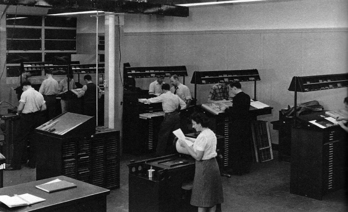
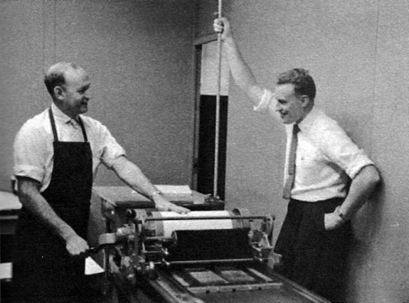
Composing room, School of Printing, Rochester Institute of Technology, 1948. Alexander Lawson is at center type bank.
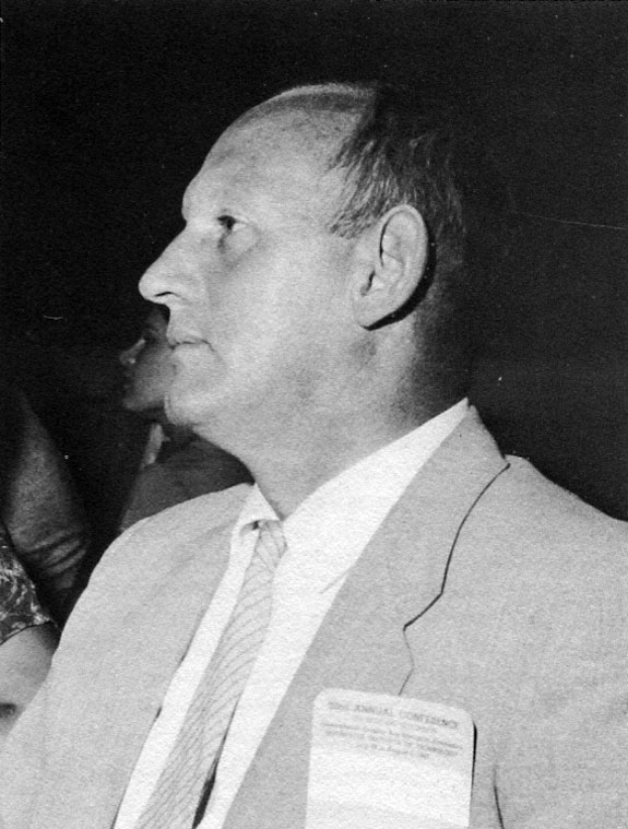
I am most grateful to the American Printing History Association for this honor, its Annual Award.¹ In this instance, though, I find it even more stimulating that you have decided to grant recognition, through me, to the teaching of the printer’s craft, more particularly to that special branch of it known as typography.
1. Alexander Lawson was awarded the American Printing History Association annual award in 1981 for his many books and articles on typography and his years of distinguished teaching, This paper is a slightly revised version of his acceptance speech. It is of special interest because it describes both historical attitudes and changing patterns of teaching typography in a period that does not seem so long past but demonstrates considerable differences.
I almost said the art of typography; but caution must be exercised here, since such a concept has always been somewhat controversial. That distinguished printer Joseph Blumenthal, who was honored on this platform in 1978, called the splendid exhibition of books he mounted at the Morgan Library in 1973 The Art of the Printed Book. However, many practitioners have decried the term art in conjunction with typography. In this respect Beatrice Warde, that lovely lady of fond memory, once coined a word to bridge the disputation. She suggested, tongue in cheek no doubt, typotect to describe the compositor as designer and printer, in the sense that an architect is a designer and builder. She felt that “in the sense in which architecture is an art, typography is an art.” And it will be remembered that that redoubtable historian Stanley Morison once wrote a book called The Typographic Arts. I would therefore hesitate to disagree with the authority represented by such eminent practitioners.
It is heartwarming to be recognized as a teacher of printing in the very city where I was introduced to the craft. My first job, in 1928, was in the editorial room of the New York American, down on South Street. There my responsibilities as a copy boy necessitated many visits to the composing room located on the floor above the editorial department and joined to it by an open spiral staircase. The sounds and smells of that busy composing room excited me most. I confess that I spent too much time there, away from the irate calls of “Boy!” on the floor below.
At that time most copy boys expected to become reporters; but I succumbed, instead, to the stimulation of typesetting and make-up with metal types, then part and parcel of metropolitan newspaper production. Fortunately, one of the compositors whom I got to know recommended that I consider a commercial printing establishment for an apprenticeship, rather than the newspaper office with its more limited opportunity for depth of experience. Acting on this sound advice, I took a job as shop boy in the composing room of an excellent firm in Brooklyn where I eventually served an apprenticeship. I remained there as a compositor until December 1941, at which time, some of you may remember, the normal sequence of events underwent an abrupt change.
During my apprenticeship in the thirties I came under the guidance of two great and natural teachers of printing, and it is to them that I owe my own subsequent career in teaching. The first was Bruno Menzer, who taught in the School of Printers’ Apprentices where every registered apprentice was by Typographical Union ruling obliged to spend one day a week for four years. Menzer was a really dedicated man whose talents were not at all appreciated by many of his students or even by his faculty peers. During the Depression jobs were extremely scarce, a factor that was not conducive to learning. Also, the average apprentice was considerably older than usual owing to the scarcity of employment opportunities. Many were married and had family responsibilities; they were primarily interested in obtaining shop skills that might assure steady employment as journeymen upon completion of their five-year indenture.
Bruno Menzer constantly importuned his students to think beyond the narrow job objective as Linotype operator, compositor, or stone-hand. Apprentices who did respond were brought into the little storeroom where he kept copies of all the handouts he could weasel from manufacturers and suppliers. My own typographical library began there and was quickly filled with type specimen sheets and freebie printing periodicals such as the Westvaco Inspirations for Printers, and Doc Leslie’s PM magazine. Menzer also kept us well informed about the many events taking place in the city, such as the Fifty Books of the Year show and other exhibitions of fine printing. When anyone of importance was giving a lecture we were sure to be notified. For example, the Club of Printing House Craftsmen frequently featured typographers at its monthly dinner meetings and always allowed “Bruno’s Boys,” as we were called, to come in after dinner for the talks.
To be a young typographically oriented printer in that time was a heady experience indeed. In retrospect it seems that just about every important American typographer of the period appeared on the New York scene. We had the opportunity to meet and listen to D.B. Updike, Fred Goudy, Carl Rollins, Bruce Rogers, T.M. Cleland, and nearly everyone else of any importance.
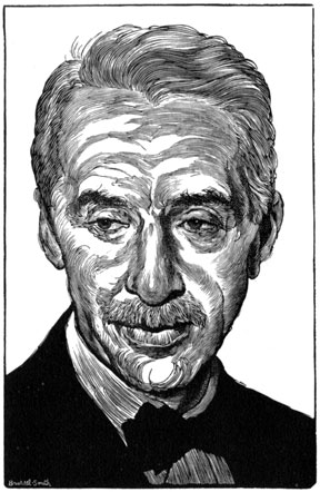
Wood engraving of O. Alfred Dickman by Bernard Brussel-Smith from the Typophile dinner keepsake, 3 December 1962.
An even more helpful teacher was O. Alfred Dickman, then ad production manager of the Herald-Tribune. As a young man in the 1920s he had worked at the Printing House of William Edwin Rudge when Bruce Rogers had attracted that coterie of fledgling printers who were soon to establish their own reputations, including such figures as Joseph Blumenthal, Peter Beilenson, Milton Glick, John Fass, and Melvin Loos.
Dickman had attended Carnegie Tech when Porter Garnett was teaching there and had been inspired by participating in the Laboratory Press experiment. For many years Dick volunteered time from a very busy schedule to teach an evening course for the New York Employing Printers Association, now known as Printing Industries of Metropolitan New York.
The course, taught in the Printing Crafts Building on Eighth Avenue, was a revelation to the apprentice compositor from Brooklyn. Dick always stopped at the newsstand in the lobby and bought copies of the current Saturday Evening Post for every student.
The class each week consisted of working through the magazine from the ad on the inside front cover through the text to the outside back cover. Most evenings this operation took considerable time; the classes rarely ended as early as 11:30, although they began at 7:00 and were scheduled for only an hour and a half.
Although unstructured, the lectures represented a running history of printing, a manual for typeface recognition, a system of advertising production procedures, a handbook of printing processes, and, best of all, an anecdotal Who’s Who of the entire world of print. Since our bow-tied teacher was part of the inner circle of that world, we soon found ourselves involved in all its activities and actively espousing all of our teacher’s enthusiasms. I was so captivated that when the course ended I immediately signed up for another go.
When I was young, printers considered themselves well up on the labor totem pole, a few cuts above ordinary workers. Such was the case with the literate compositors particularly, although Linotype operators and even proofreaders were often included. It is of course beyond my competence to include pressmen in such an elect group. The esteem was such that the compositor would have been difficult to single out from his employer if both were observed entering an establishment in the morning. Only when he got inside the composing room did the comp change his attire for something more appropriate to the job at hand.
One story may illustrate the point. I recall once—I think it was in the spring of 1929—when a youth who had been a shop boy, charged with cleaning Linotype machine plungers, sweeping floors, and sorting leads and slugs, finally received his long-awaited elevation to apprentice and the prospect of full-time membership in the Big 6 Typographical Union. On the first morning in this new role he turned up at the time clock in front of the foreman’s desk a minute or so late. He punched in to the accompaniment of a long, low whistle and a frantic banging of composing sticks on every frame in the shop. The tardiness may have been the result of his preparatory exertions: he was most properly accoutered in a Chesterfield coat, a derby hat, and—peeping from beneath the trousers of his vested suit—a pair of spats!
Before leaving that Brooklyn composing room, I should mention another common fact, even outside the Borough of Churches. All compositors felt themselves capable of the highest quality of typographical design and resented being relegated to following someone else’s layouts, especially those from outside the shop.
Joseph Moxon, in the seventeenth century, first called compositors typographers; but during the twentieth century the idea gradually evolved that a typographer was not to be troubled with having to learn the case and work in a dusty comp room. By the 1950s. alas, even typographers were relegated to inferior status by a new breed calling themselves type directors.
In my youth such a superstructure of brass was unimagined. Work coming into the shop was given to the foreman to assign to the comp best equipped to perform it. Thus the man most competent in letterhead design would expect to have a go at every such order coming into the plant. Another comp might get the full-page ads, still another the filler ads, and so forth. Younger compositors were expected to keep up with design trends. This was often accomplished through courses in what was then called layout. In the New York area many such courses were available, including those offered at the Mechanics Institute on 44th Street.
However, the top sources of information on typographic trends were the trade periodicals, the best known of which were the Inland Printer and the American Printer. Both were strong on typography because their editors, J.L. Frazier and Laurance Siegfried, were so inclined. In my shop the IP received preference, primarily because it was peddled on the premises by an old printer called Scotty who visited most of the New York print shops to sell such items as composing sticks, tweezers, and line gauges.
Scotty also toted copies of the current IP. Although it cost forty cents, a horrendous price for a magazine then, most of the comps and apprentices purchased copies. At lunch-time for the few days following his visit, IP and its contents were volubly discussed. It was the custom to eat at the case, so to speak, since almost no one went out for lunch. In such circumstances everyone could get his stick in when it came to a critique of something in the magazine.
The Inland Printer had one extremely popular typographic feature, “Specimen Review,” written by Frazier. To this department, which he edited for 47 years, every printer was invited to send examples. Most of them did, and the amazing thing is that Frazier looked at everything, then attempted to critique what must have been an enormous rag-tag collection of typographia. Certain favored items were reproduced in the magazine, along with some bad examples. But even if a piece was not exhibited, the sender might find a word or two of praise or criticism. This column alone ran to above 5,000 words per issue, evidence of Frazier’s tremendous interest in promoting good typography: 60,000 words per year for almost half a century!
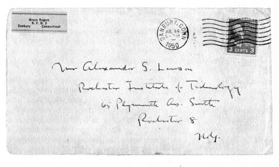
Everybody read the feature, and anyone looking into the files will discover the early work of many typographers who later achieved distinction. Even Bruce Rogers read Frazier’s column. I know, because Frazier once reproduced a piece that I printed, and I received a letter from BR asking for a copy. I still have the letter, of course, and you might be interested to learn that the greatest living typographer used Woolworth’s best stationery, and for a letterhead he pasted on a three-line sticker he had no doubt purchased from the local stationery store!
But the hot discussions engendered by the IP in my shop about the appearance of what might be called ordinary printed materials show that many just as ordinary compositors had tremendous pride in their calling.
The American Printer was directed toward a more sophisticated audience. Between 1930 and 1940 Larry Siegfried provided outstanding guidance on typographical matters. Today, unfortunately, the subject receives almost no attention in the trade press.
Before moving on to my experiences in the teaching of typography, I would like to share a few observations on the craft of printing as practiced in the United States Navy, circa 1942. I entered that service in the first wave of patriotic enlistment that began early on the morning of December 8, 1941. Turning down the offer of a printer’s rating that would keep me ashore, I elected to be just a sailor. I quickly discovered that the road to being a fighting tar was fraught with hardship, such as chipping paint and scrubbing decks. After some three months as an apprentice seaman aboard the USS Arkansas in the wintry North Atlantic, I found the prospect of returning to a warm composing room remarkably appealing, and “heaving around” in the deck division of a battleship, less so.
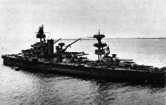
My division officer suggested a transfer to a ship with a print shop. It so happened that another vessel in the area—the battleship New York—had such a facility. Without any enquiry about the need for an additional printer on that ship I was ordered to report for duty with “bag, baggage, and necessary transfer papers” in the print shop of that vessel. I found the shop two decks below the main deck. It was a compartment some twenty feet square containing 1 Linotype machine, 2 platen presses, 1 cutter, 2 stones, 3 type frames, lockers, and folding bunks for 8 rated printers, and, at the moment of my entry, some 13 sailors in various stages of uniform.
They were congregated about the two stones with no apparent work in hand. This situation was the ordinary routine of the shop, since the leading printer, a petty officer first class, was an owl who preferred to sleep most of the day. Since his bunk was in the shop, the work must be done at night. However, this arrangement meant that the rest of the print shop gang were on their own during the day, becoming fair prey for sharp-eyed boatswain’s mates looking for hands for working parties, particularly for chipping paint, an activity that seemed to go on for 24 hours daily. After a day of chipping paint we printers were then expected to turn-to (as work is called in the naval service) on shop duties. This was not terribly frustrating most of the time since there was only enough printing to keep perhaps two men comfortably occupied for three or four hours at a stretch.
After a couple of months of this duty, during which the ship accompanied two convoys to Iceland and Scotland, I was beginning to yearn for even the old Arkansas. The parting of the ways finally occurred when Lawson, the comp, was assigned a job of printing—as a platen pressman, no less. The job was to print the ship’s leave papers, 8 x 10 sheets in two colors. The second color was an illustration of the New York in a vignette halftone. Of course I had never before operated a platen press or attempted any kind of makeready, not to mention that of a vignette; but in the United States Navy at war this deficiency constituted no problem.
After about an hour the senior printer came over and asked me what, exactly, I was doing. The sheet I had in my hand showed the half-tone with an extremely hard edge, which even a comp knew would never do for a vignette. I had only done what I knew was standard makeready procedure in that shop—to place a sheet of bond under the form. I explained as best I could. He looked me over. “What do you call that cut?’
“A vignette.”
“A what?”
“A vignette.”
He leaned over the press to demonstrate the full strength of his authority; a first class “crow” complete with the book emblem that represented the printer’s rating. This insignia was intensified by the four red hash marks indicating his 16 years of service.
“Print the damned thing with a good edge!” he demanded.
One day later I talked to the navigator and transferred into his department as a quartermaster. This transfer was easy because, in typical U.S. Navy organization, the print shop was part of the navigation department. In any case I lived happily ever after as a quartermaster and by 1945 actually felt that I had made a small contribution to the course of the war.
In the summer of 1945, when the war was winding down, I began to think of the future. In the Inland Printer I read a short news item about an enlarged course in printing offered by the Rochester Institute of Technology. I had thought only Carnegie Tech offered a college course in printing. Although I had been content working as a compositor through 1941, I did harbor ambitions to get into typography and design eventually. Evidence of this, I suppose, was that fact that I carried a copy of Updike in my navy sea bag.
When I was mustered out I visited my former teacher, Alfred Dickman, and told him that I was considering going to school. He was enthusiastic because he had done the same thing after his own service in World War I. He had studied at Carnegie Tech, then in its early days under the superb guidance of Harry Gage. Since I could not qualify for the Carnegie of the 1940s, the Rochester school seemed to be the only chance for continuing my education.
R.I.T. was then a small two-year college that did not grant degrees of any kind. Instead it catered to what was called career education. Its printing program was under the direction of Byron Culver, who had been an instructor in art when the printing course began in 1937. In response to an enquiry about entrance, he suggested that I come to Rochester for an interview. That was December 1945. On the strength of my experience as a practical printer, I was accepted for a class beginning in February 1946.
After a few weeks at the school, I was asked to teach an evening class in hand composition. I enjoyed this so much that when I completed the program for a diploma, I accepted an offer to remain at R.I.T. as a full-time instructor in hand composition and typography, beginning in September 1947.
At that time the Department of Publishing and Printing had only six full-time instructors; but with the influx of students under the GI Bill, it grew rapidly. About fifty students were enrolled by September 1945; and when I retired in 1977 there were more than 700 in the various programs leading to degrees, including the master of science. During the same. period the Institute’s assets increased from two or three million dollars to over 200 million in 1980.
When I began teaching, the hand composition courses at R.I.T. were very practical. In 1937 the requirements had been strictly oriented to the needs of small newspaper offices, since prior to becoming part of the R.I.T. program, the printing school had originated in Ithaca under the sponsorship of a group of New York state publishers. By 1948 it was obvious that this curriculum had to be revised. Training for the trade was no longer the exclusive responsibility of the department; the larger requirements of the printing industry and of the rapidly expanding number of students needed to take priority. This abrupt change of philosophy contributed to the expansion of the whole program and resulted in the present esteem bestowed by the industry itself.
Hand composition was offered in three courses. The introductory course was designed to cover composing room practices, copyfitting, and the composition of printed material in all its forms. For many students, depending upon their area of specialization, this was the only one required for credit. A second course, continuing the practical approach, included the design and setting of typical jobs encountered by most printing plants.
It became evident that many students, intrigued by the opportunity for hands-on typographic composition, wanted greater scope for typographical design. So after two years an advanced comp course was added in which the student determined what to accomplish and was granted complete freedom in the use of the composing room facilities to achieve that goal. This course finally evolved into what might be termed a private press operation.
In making these curriculum revisions, I had of course kept in mind the typographic experiments from 1922 to 1933 in Porter Garnett’s course at Carnegie Tech. His introduction to fine printing allowed the participants to produce work that was expected to be—and frequently was—of an impeccably high standard. Garnett called the course the Laboratory Press. During his eleven years at Pittsburgh his students developed a love for the craft of the printer that they retained all their lives. It may also be noted that they developed a consummate understanding of the skills involved.
However, in spite of the great enthusiasm of established typographers throughout the country, Garnett encountered a great deal of opposition in his efforts to revive ancient standards in an increasingly mechanistic environment. There were no problems with the students, since the course was an elective. However, criticism from the industry was harsh indeed and included threats to withhold funding for the school. Under such pressures, Garnett resigned and returned to California, considerably embittered by the reaction to his ten-year effort to revive interest in historic printing. Eventually, when the printing produced by the Laboratory Press was distributed and widely praised for its quality, the industry itself began to take notice.
Carnegie Tech’s printing course had started in 1913, much as had the programs at R.I.T. twenty-five years later, without degrees. When the program became fully accredited in the 1920s,Carnegie became the first college to offer a degree course in printing. The graduates of the program were therefore expected to help bring the printing industry into the 20th century.
The elective course at the Rochester Institute of Technology that resulted in the Press of the Good Mountain never reached the heights of the Laboratory Press endeavor. Since its beginning in 1950, however, it has enjoyed continued popularity. It still fills a need within a program which is necessarily oriented to the present and future requirements of an industry that has progressed far beyond its craft beginnings.
The name of the press which supplies the imprint for the Typographic Workshop course at R.I.T. is a reference to the name of Johann Gutenberg, John of the Good Mountain. The beginning of the Press of the Good Mountain was almost accidental. For many years the students of the School of Printing issued a journal called Typographer, and it was the responsibility of its editor to write an account of the type selected for each issue. For one issue set in Baskerville, the editor, Harry Bollinger, asked me for reference material. At that period the typographic shelf of the R.I.T. library was woefully inadequate, but the locked case of the Reference Room in the Rochester Public Library had many books on fine printing, most of them donated by Horace Hart as a memorial to his father. One of the books in this collection was the Typophiles edition of John Baskerville, by Josiah Henry Benton. I suggested that Bollinger visit the public library and look it over.
About half an hour later he returned to the comp lab, somewhat red-faced and obviously chagrined. He had been run off the premises by the keeper of the key to the collection of fine books. After some questioning, I learned that the copy of the book he wished to examine was uncut. This represented no problem for young Harry. He simply went over to the desk and asked the librarian for a pair of scissors!
Naturally I went to the library immediately, only to be chastised for having students who did not appreciate fine printing. The books were on the shelf, according to the elderly librarian who presided over the collection, as examples of beautiful printing and were not there to be read!
Bollinger and I hit the books once more and extracted a number of references to uncut pages. Then, copy in hand, Bollinger reached into the full case of 13-point Poliphilus—type cast, incidentally, from the same matrices which had been used for Bill Dwiggins’s lovely edition of Marco Polo, produced by the Printing House of Leo Hart. A day or so later a booklet titled “The Uncut Page” emerged with the imprint of The Cloze Press.
I showed a copy to Paul Bennett, who enthusiastically requested an edition of 350 copies as a Typophile Monograph and inspired the name and concept of the R.I.T. private press. This Monograph printing became the first Press of the Good Mountain imprint, Typophile Monograph No. 39 (1950), a most auspicious beginning. Naturally we sent a copy, uncut, to the Rochester Public Library. The gift was acknowledged by postcard.
One of the pieces in “The Uncut Page” is a bit of doggerel by Carl Purington Rollins called “On Buying at Auction a Book Once in the Library of Theodore Low De Vinne.”
O scholar-printer! Ripe with all the lore
Which appertains to printing and to type,
And, as becomes a man with learning ripe,
A bookman with an ever growing store.
From out their teeming pages you distilled
The essence which you freely gave to us
Who followed in your footsteps, envious
To know it all, albeit far less skilled.
Your learning oft my ignorance has vexed,
But, Master, now you have me sore perplexed
(although nil nisi bonum one believes):
This book which so much pleases, also grieves,
For when I open it to read the text
I find that you had never cut the leaves.²
2. Off the Dead Bank: Addresses, Reviews, and Verses by Carl Purington Rollins. New York: The Typophiles, 1949, p. 137. Typophiles Chap books XIX.
From 1950 to the present, the concept of a private press as an opportunity for ambitios young printers to try their hands at the production of a complete piece of printing has been increasingly successful. While the School has equipment worth many millions of dollars in all its laboratories, most of it is used for teaching and training purposes and is therefore rarely engaged in turning out finished work. Another problem that interferes with the opportunity to see a job through all its production steps is the organization of most of the laboratories into areas of specialization. It has therefore been necessary to make the typographic composition lab as self-contained as possible in order to facilitate its use as a private press for advanced students.
Naturally many of the products of the press have been, and still are, restricted both in size and number of copies. However, students are allowed access to the equipment any time it is available. Many of them have taken advantage of such freedom to produce more complicated projects. At present the two newer laboratories—papermaking and bookbinding—make it possible for every aspect of the production of a book to be personally controlled. For example, for one job, a student hand-cast Goudy Kennerley from the original matrices cut for Goudy by Robert Wiebking in 1911.
Fortunately, superb resources are available for types. Professor Provan, who now teaches the course, has long been active and resourceful in updating R.I.T.’s Monotype facilities, adding many hundreds of fonts of matrices and a Supercaster, thus allowing the student a wide choice of typographic options. Printing, for the most part, is done on Vandercook proof presses, eight of which are available, including two automatics. So far no one has become very excited about using the school’s Washington hand press.
Over the past thirty years the laboratory’s output has of course been varied, both in its subject matter and in the competence of its production. But many items have turned up in booksellers’ catalogues. In 1979 Muir Dawson offered two of them. One was a book on Bodoni which Professor Provan and I did in our spare hours, and the other was a reprint of Gregg Anderson’s essays on the Grabhorn Press which Michael Bixler printed when he was a student at R.I.T.. Dawson listed Bodoni at $90 and Grabhorn at $100. When I next ran into Mike, not knowing whether he had seen the Dawson catalogue, I asked him the difference between my Bodoni and his Grabhorn.
“That’s easy,” he answered, “ten bucks!”
Incidentally, Bob Grabhorn once told me that the Bixler job was the best “first piece” of printing he had ever seen.
I am most hopeful that the chance to produce printing of the highest traditional standards will be available as part of the R.I.T. program for a long time to come. My experience there indicates that for many individuals such an opportunity has provided the most meaningful insight into that “broad and humanizing employment” that Daniel Updike so aptly termed the practice of typography. Unquestionably the school’s primary responsibility is to provide the most current technical education geared to every demand from the industry it serves. But the school should never neglect the historic factors that are the very foundation of the present industry.
Great difficulties are bound to be faced in the teaching of typography in a computer oriented technology, but the effort represents a challenge of enormous importance for the future well-being of this industrialized craft. Modem typesetting techniques can be implemented properly only by those of us who are grounded in the accomplishments of the past. After all, the final appearance of the printed word is what typography is all about. The procedures for accomplishing this end have frequently been affected by technological change.
Exactly how to bridge the gap between contemporary technology and the accepted practices of the past will be the principal question to be solved by the new generation of printers. As a college teacher, I have lived in a world of young ideas. I am therefore confident that satisfactory solutions will be forth-coming. While many of us are nostalgic for the past, our mission is to encourage the forthcoming transformation to what will undoubtedly be an exciting new era of achievement.
A printing history of five centuries’ duration has encompassed many such challenges and has survived them all. No less may be expected of us today.
This article first published in issue 12 of Printing History: the Journal of the American Printing History Association (pp. 17–26, volume VI, number 2, 1985). Special thanks to the American Printing History Association, for permission to reproduce this article online. Posted here with permission of the Estate of Alexander S. Lawson.
