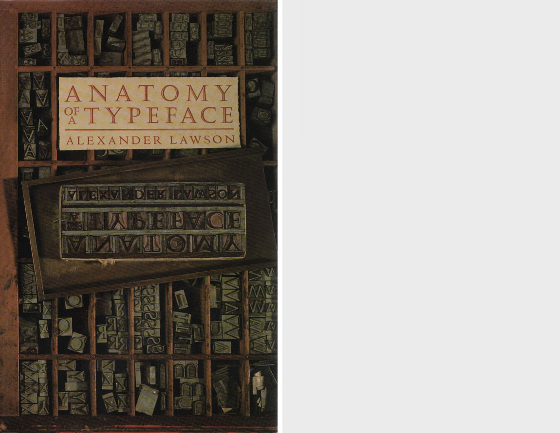
Anatomy of a Typeface
Publisher: Boston : David R. Godine, Publisher
Year: 1990
Description: 428 p. : ill. ; 23 cm.
Notes
Subsequently published in Great Britain by Hamish Hamilton Ltd. in 1990.
Publisher’s Comments
To the layman, all printing types look the same. But for typographers, graphic artists and others of that lunatic fringe who believe that the letters we look at daily (and take entirely for granted) are of profound importance, the question of how letters are formed, what shape they assume, and how they have evolved remains one of passionate and continuing concern.
Lawson explores the vast territory of types, their development and uses, their antecedents and offspring, with precision, insight, and clarity. Written for the layman but containing exhaustive research, drawings and synopses of typefaces, this book is an essential addition to the library of anyone’s typographic library. It is, as Lawson states, “not written for the printer convinced that there are already too many typefaces, but rather for that curious part of the population that believes the opposite; that the subtleties of refinement as applies to roman and cursive letters have yet to be fully investigated and that the production of the perfect typeface remains a goal to be as much desired by present as by future type designers.” Anyone aspiring to typographic wisdom should own and treasure this classic.
Colophon
Anatomy of a Typeface was set in Galliard, a typeface designed by Matthew Carter and introduced in 1978 by the Mergenthaler Linotype Company. Based on the type created by Robert Granjon in the sixteenth century, Galliard is the first of its genre to be designed exclusively for phototypesetting. A type of solid weight, it possesses an authentic sparkle that is lacking in the current Garamonds. The italic is particuarly feliticous and reaches back to the feeling of the chancery style, from which Claude Garamond’s italic departed.
Printed by Maple-Vail Book Manufacturing Group, Binghamton, New York, on Glatfelter Offset Smooth Eggshell.
- Read a limited preview of Anatomy of a Typeface at Google Books.
- Purchase a used copy of Anatomy of a Typeface via Abebooks.com.
- Locate a copy of Anatomy of a Typeface in a library.
Table of Contents
| Preface | 7 |
| Goudy Text and the Black-letter Types | 13 |
| Hammer Uncial | 35 |
| Cloister Old Style | 47 |
| Centaur | 62 |
| Bembo | 74 |
| Arrighi | 84 |
| Dante | 98 |
| Goudy Old Style | 110 |
| Palatino | 120 |
| Garamond | 129 |
| Galliard | 141 |
| Granjon | 147 |
| Sabon | 151 |
| Janson | 158 |
| Caslon | 169 |
| Baskerville | 184 |
| Bodoni | 196 |
| Bulmer | 209 |
| Bell | 218 |
| Oxford | 229 |
| Caledonia | 243 |
| Cheltenham | 253 |
| Bookman | 262 |
| Times Roman | 270 |
| Newspaper Types | 277 |
| Franklin Gothic and the Twentieth-century Gothics | 295 |
| Clarendon and the Square-serif Revival | 308 |
| Optima and the Humanist Sans-serif Types | 324 |
| Futura and the Geometric Sans-serif Types | 337 |
| Script, Cursive, and Decorated Types | 349 |
| Type Making from Punch to Computer | 381 |
| Bibliography | 405 |
| Index | 413 |
