Design Quality—The Extra In a Knopf Book
 “The job we’ve done, as I see it, has been to sell . . . books by authors some of whom we honestly believe to be the great ones of our times; to make these books as good-looking as possible; and to prove the fallacy of the remark I heard so often as a young man that so-and-so’s book was too good to sell.”
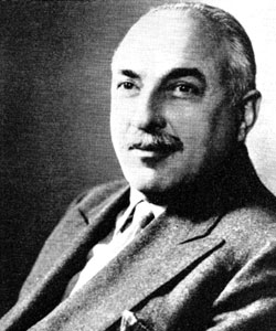
The above statement does not make a typographer out of book publisher Alfred A. Knopf, but it certainly illustrates the quality which has endeared him to book readers in his 48 years as a publisher.
Knopf’s introduction to the world of printing came through reading his father’s copies of books by Theodore L. DeVinne. In 1914, when working in New York with Mitchell Kennerley, he met his first type designer, Frederic Goudy, and by virtue of this association, “. . . Remained for some years convinced that the final ultimate beauty, not alone in type, but in typography as well, was vested in Kennerley and Forum.”
Later Knopf became acquainted with Elmer Adler, who introduced him to the work of other American designers—Bruce Rogers, William A. Dwiggins, and Thomas M. Cleland. All of these outstanding book typographers later designed for the Knopf imprint, but it was Dwiggins who contributed most to the reputation which Knopf built for the physical appearance of his books.
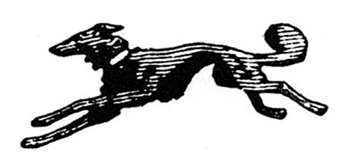
 After the appearance of Willa Cather’s My Mortal Enemy in 1926, Knopf books took up half of Dwiggins’ time until his death in 1956. During this 30-year period hundreds of Dwiggins’ designs bore the famous trade-mark of the borzoi which Knopf has used since 1915.
Serious bibliophiles all become acquainted with the history of the printer’s craft. Many of them arc more conversant with type and design than are printers themselves. For the ordinary reader, however, Knopf’s work makes him at once aware that the volume he buys or borrows is a part of the heritage of printing.
The colophon has for over five centuries been an established part of a well-planned book, but for too many years most books have been produced with only the publisher’s imprint, plus the line, “Printed in USA.”
Alfred Knopf revived the colophon, and it is rare that a Knopf book is issued without the page devoted to “A Note on the Type in Which This Book Has Been Set.” Here, in addition to a short history of the type, appears further information concerning the name of the printer, the binder, and the designer. Because the book is already above the average of trade-produced books, the reader becomes conscious of the part that the printer plays in its design. Unquestionably, ordinary readers are thus prompted to become more aware of well-planned books.
Knopf carries his contribution to higher design standards even further by listing the name of the designer in the advertisements for Knopf books.
The coupling of the integrity of his list with its physical appearance has brought to Knopf many honors in his long career as a publisher. Among these is the Medal of the American Institute of Graphic Arts “for excellence in the design and typography” of his publications; this, in spite of Knopf’s statement that he was a trade publisher and not a patron of fine printing.
Many of the distinguished writers who have been published by Knopf have been delighted to have their work so competently packaged and with rare exceptions have accepted his judgment concerning the design of their books. At an AIGA Design Clinic called “Author Looks at Format,” John Hersey had this to say:
“I have been persuaded that the appearance of a book, particularly (from my point of view) its paper, typography, and page design, can help the author in the process of communication far more than the author would like to admit. I count myself lucky to have had my writings put into books by a publisher, Knopf, who has a deep feeling for this mysterious ability of well-designed pages to make words on them clearer and more meaningful and more moving.”
This article first appeared in the October 1961 issue of The Inland Printer/American Lithographer.