William Addison Dwiggins Influenced Typographers
- Renowned typographic designer served for many years in top posts
- WAD known as typographer, decorator, painter, satirist, “poet in prose”
- Two years ago his death was mourned; he re is the story of his career
Less than two years ago, on December 25, 1956, Americans mourned the death of one of this country’s truly great typographic designers—William Addison Dwiggins. The influence of this quiet resident of Hingham, Mass., will long be remembered by the fraternity of printers, particularly those who are keenly interested in typography and printing design.
Who was this man Dwiggins? We can safely remark, first, that he was a designer of books.
Book Styling Increases
Some 40 or 50 years ago the publishing of books was a business. It still is, but today publishers are interested in the styling of their product. While it is still most important to publish an author who has something to say, most publishers also try to present him in a good-looking package. Formerly, the appearance of a book was something that just happened. There were exceptions, of course, particularly in the work of private presses and a few notable designers, but the ordinary trade book was notable for its extreme lack of taste in design.
Having worked in the graphic arts from the turn of the century as an illustrator and designer of privately printed books, W.A. Dwiggins decided in 1919 to do something about trade book design. In company with Laurence Siegfried, he formed an imaginary group which he called the Society of Calligraphers. Over its imprint the two men produced a tract with the engaging title of Extracts From an Investigation into the Physical Properties of Books as They Are at Present Published.
This publication, which was offered for sale at 50 cents a copy, presented the results of a supposed questionnaire of publishers and their production people. The findings of the “Society” resulted in an explicit recommendation: “The collected data of the explorations can lead but to one conclusion: that the whole fabric of standards of workmanship will have to be rebuilt from the beginning.”
When the Extracts reached the offices of various publishers, a minor explosion took place. Who composed the Society of Calligraphers? How numerous were its members? Anyway, who cared about how books looked, as long as they were cheap!
One publisher, Alfred Knopf, became sufficiently interested in this seemingly fresh approach and asked to be shown. There resulted an association which lasted until WAD’s death, and which gave the Knopf firm the reputation for producing books which are typographically excellent.
There is little doubt that Mr. Dwiggins’ work influenced book design, although there has been no actual imitation of his style, which is completely individual. The decorations of a Dwiggins’ book may appear to violate many of the so called rules of design, but their effect is one of simply belonging. For one thing, they are timeless. It would be difficult indeed to hang a date on a design by WAD.
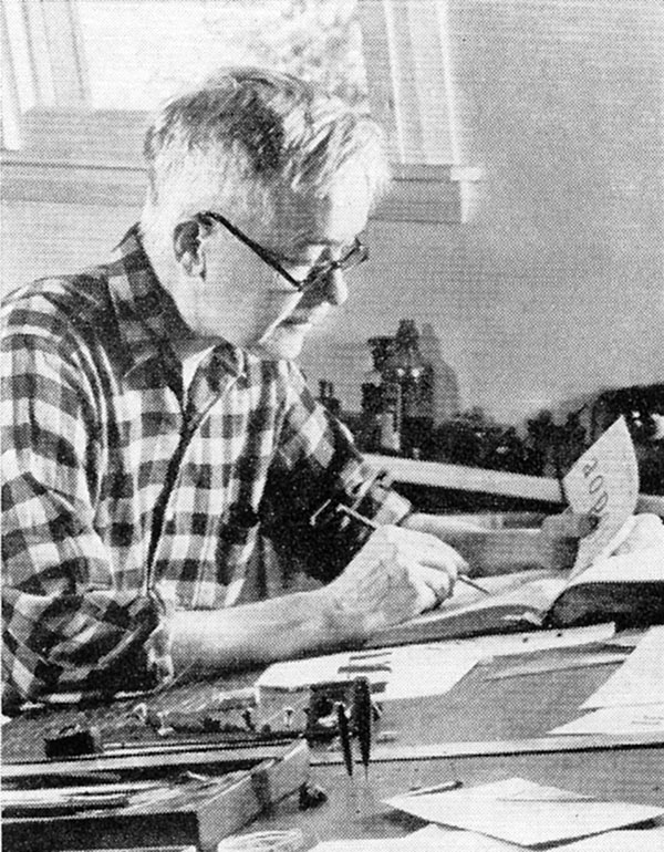
W.A. Dwiggins in his Hingham, Mass., studio
Book designing, however, was but one outlet for the extraordinary talent of Bill Dwiggins. Harvard’s Philip Hofer called him “. . . A man who is America’s one truly modern typographer, and by far her outstanding decorator and calligrapher; a mechanical wizard; type designer and specialist in advertising layout; an illustrator, mural painter, costume designer, and sculptor; a playwright, satirist, and even beyond the best of his art-a thinker and a poet in prose.”
Mr. Dwiggins was born in Martinsville, Ohio, in 1880. He became an art student at the age of 19, and studied at the Chicago school run by Frederic W. Goudy who had not then attained his fame as a type designer.
In 1904 WAD went to Boston as an artist. He freelanced in advertising until 1928, the year he wrote Layout in Advertising, still considered by authorities to be one of the best texts on the subject.
Known Best For Type Designs
It is as a designer of types that Mr. Dwiggins is best known to practical printers. Mergenthaler Linotype Co. induced him to try his hand on a sans serif face, just after the introduction of the Futura and Kabel types from Germany. This request resulted in 1929 in the cutting of the well-known Metro series, for which he prepared the original basic design and then supervised the additional weights which were soon in demand.
His reputation as a designer of book types was assured when in 1936 Linotype brought out Electra, a remarkably clean letter in the modern classification. It was an immediate success.
In 1939 Caledonia was introduced. With this face, WAD made a happy attempt to liven up the staid Scotch Roman by blending it with suggestions of Bodoni and Bulmer. Undoubtedly, Caledonia has been one of the most popular types of the last 19 years. It is used for a wide variety of printing—books, periodicals, and advertising material.
The wide acceptance of Caledonia in book publishing may be noted in a glance at the index of the Fifty Books of the Year Exhibit. Since its introduction, Caledonia has appeared in no fewer than 101 titles.
The last Dwiggins type to be issued by Linotype is Eldorado, a book type based upon early Spanish models. At his death there were several other designs in pilot form and in an experimental state.
As a writer WAD will be remembered with affection by many printers. His prose was as effective as his designs-uncluttered and with whimsical touches. No dogma-and this can be attested by anyone who has read Layout in Advertising. The same humor has been applied to the many booklets, tracts, and articles that have been issued from his studio. In 1947 the Typophiles collected a number of these random pieces and published them in a little volume called Mss by WAD. Out of print very quickly, this is a must item for Dwiggins’ admirers.
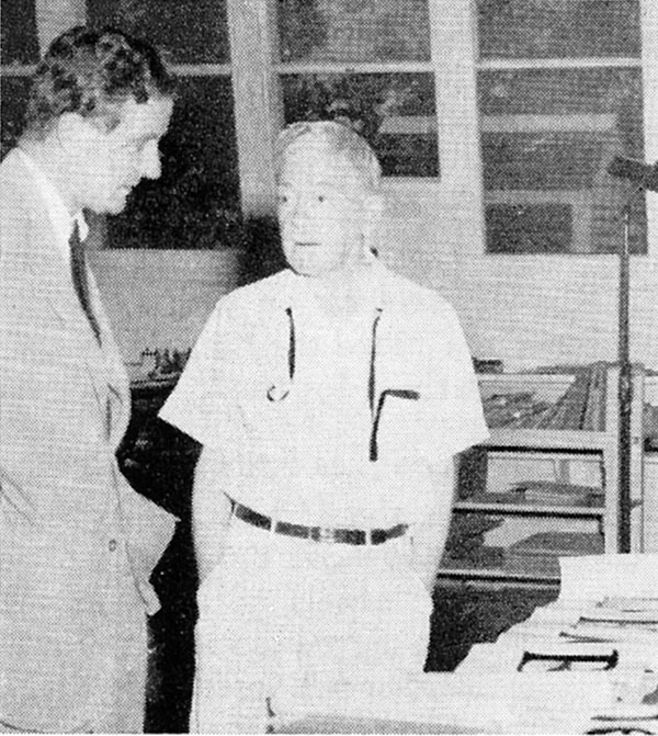
Jackson Burke (left), director of typographic development for Mergenthaler Linotype, visits with William A. Dwiggins in the latter’s home studio.
Those printers who have long agonized about the design of the printing stemming from government bureaus would discover their thoughts formalized in a short book that Dwiggins wrote and illustrated in 1932: “Towards A Reform of the Paper Currency Particularly in Point of its Design.”
This Art Is Not Art
In a footnote in this volume (beautifully produced by the Limited Editions Club) he stated: “. . . I have stumbled upon a theory advanced to explain the peculiar quality of Washington art. This explanation proceeds on the simple assumption that the Washington brand isn’t art—that it was never set up to be art—that no one in the bureaus claims it is art, or ever thinks of it that way. It is another kind of stuff altogether. It sours easily because it isn’t intended to stay fresh—it is meant to last only for the short time during which it is being manipulated. The proponents of the theory maintain that the whole affair, in fact, is simply manipulation—a civil service process for filling in the time. You are given a piece of paper and instructed to cover it with lines copied from a pattern sheet; you go on putting the lines on the paper until the space is full and then you are through and it is time to go and play golf.”
Since these words were written, the GPO has improved its design immeasurably. Perhaps the jolt was sufficient.
While there never was a Dwiggins’ “school”—mainly because of the distinctiveness of his work—he has come in for a share of honors in his chosen craft. In 1929 he was awarded the Gold Medal of the American Institute of Graphic Arts. In 1947 Harvard presented him with the honorary degree of Master of Arts, a most appropriate designation.
The period since the passing of this quiet man from Hingham has demonstrated the extent of the loss sustained by the printing craft. We miss his well-reasoned remarks about current foibles and, of course, the continued flow of further examples from his hand.
About this “genius” who made music with words, Paul Hollister wrote as long ago as 1937: “He is no cultist; he wants you to like him as he strikes you only. He does not wane you to read into his work anything you do not see. He wants you to keep your eye not on the designer but on the author. All his life he has done his level best co become the perfect orchestral accompanist. Such an ambition is as rare as it is admirable.”
This article first appeared in the “Composing Room” column of the September 1958 issue of The Inland Printer.