Anatomy of a Type—1: Cloister Old Style
In A Note on His Aims in Founding the Kelmscott Press, written in 1895, William Morris stated, “By instinct rather than by conscious thinking it over, I began by getting myself a fount of Roman type. And here what I wanted was letter pure in form; severe, without needless excrescences; solid, without the thickening and thinning of the line, which is the essential fault of the ordinary modern type, and which makes it difficult to read; and not compressed laterally, as all later type has grown to be owing to commercial exigencies. There was only one source from which to take examples of this perfected Roman type, to wit, the works of the great Venetian printers of the 15th century, of whom Nicolas Jenson produced the completest and the most Roman characters from 1470 to 1476.”
The type which resulted from this return to 15th century typographic forms was named the Golden type, from the splendid three-volume work of the Kelmcott Press, The Golden Legend. While Morris photographed and enlarged the Jenson type, his own letter was not, as he wrote, a “servile” copy. Indeed, to modernize, the Golden type in the Jenson type are primarily alike in only generalized characteristics. However, their use in the magnificently printed Kelmscott books inspired printers can type designers to re-examine 15th century sources for new types.
The commercial typefounders were quick to copy the Golden type, producing it under a variety of names, such as Jenson, Kelmscott, Ancient Roman, etc. But the most important contribution of Morris was the revival of interest in the early Italian types. Another amateur printer, T.J. Cobden-Sanderson, established the Doves Press. For his type he also used the Jensen letter, but with numerous improvements over the Morris returning.

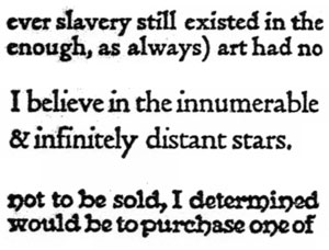
Early adaptations of 15th century Venetian typefaces, these three examples preceeded Cloister Old Style. At the top is the Golden Type, which started the revival, designed by William Morris and based on a face by Nicholas Jenson. Below it is Doves type, based on the same face and designed by Cobden-Sanderson. At the bottom is Essex House, another face inspired by the Golden type, but too heavy to meet modern typographic needs.
Another development leading to a more esthetic judgment of the types of Nicolas Jenson occurred about the same period when the American typographer, Bruce Rogers, then designing books for the Riverside Press in Boston, examined the copy of the great Jensen book, the Eusebius, a 1470, at an exhibition in the Boston Public Library. Animated by a desire to recreate this beautiful design, Rogers searched out other Jens0n books. He reproduced their pages in what he later described as “the search for what I fondly thought would be the ideally perfect type; not knowing then that it was something like the quest of the Holy Grail.”
In 1901, Rogers had progressed to the point of having the Riverside Press authorized the cutting of his designs. This was done by John Cumming, a punchcutter working in Worcester, Massachusetts. Originally intended for an edition of Montaigne’s Essays, and named Montaigne, the Rogers’ type was actually used for the first time in the Last Sea Fight of the Revenge by Sir Walter Raleigh, published in 1902. Rogers was not satisfied with this type in some years later improved it in the form which has since achieved international renown and the name of Centaur.
In the meantime, a number of other designs inspired by the Golden type were appearing, particularly in private press printing. Such bases as the Essex type, the Vale, F.W. Goudy’s Village type, and Merrymount (cut for Daniel Berkeley Updike by Bertram Goodhue), while admired, were soon criticized as being too heavy-handed to meet modern requirements, and is therefore not adaptable for the everyday requirements of commercial printers.
In 1911, Mitchell Kennerley published an edition of The Door in the Wall by H.G. Wells, which featured a type privately cut by Frederic W. Goudy, and named for the publisher. While originally inspired by Dutch types, particularly those used at Oxford University by Bishop Fell in the 17th century, Kennerley retains many of the Venetian characteristics of Jenson’s type.
On the basis of popular demand, then, the logical outcome was the production of a type for broad use, utilizing the principles of the private types. This need was fulfilled by Morris Benton when he designed Cloister Old Style for American Type Founders Company in 1913.
Morris Fuller Benton became a type designer through the circumstance of having as his father Linn Boyd Benton, the inventor of the pantograph device which mechanized the art of punchcutting. When he graduated from Cornell in 1896 as a mechanical engineer, the younger Benton went to work for American Type Founders as assistant to L.B. Benton, who was then organizing the production facilities of that recently-formed type combine.

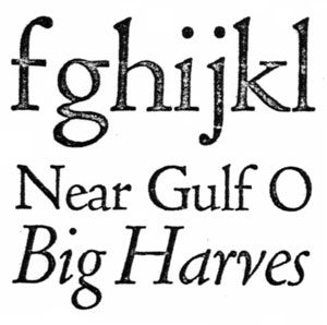
Cloister Old Style examples: At the top is the face offered by Linotype, below it is the italic, by American Type Founders. This face, designed in 1913 by Morris Benton for ATF, was also based on the type used by 15th century Venetian printers, but it better fitted current needs and therefore found broader use than the Golden type and others designed in the trend that followed.
While his first responsibilities in the foundry were related to the mechanical aspects of typefounding Morris Benton quickly developed an interest in letterforms. His first type, Roycroft, was produced in 1898. He next became involved in the numerous variants supplied to the Century family, and by 1904 was kept busy with that most successful of all American types, the Cheltenham group. In 1909 he turned to the first important revival of a classic type in the United States, that of Bodoni. Attracted to the Venetian types used by the private presses, he made a study of the work of the Italian printers. From a deep interest in this period there emerged Cloister Old Style, which became an immediate and resounding popular success.
Updike, in his Printing Types, treats Benton’s type somewhat condescendingly: “Cloister Old Style Roman was based on a study of Nicolas Jenson’s long-suffering and as yet unrivaled font, and its italic is of an interesting early form. It is a practical type; not very inspired, perhaps, yet quiet and satisfactory because not attempting too much. . . .”
Supplying an italic form to a 15th century roman is always a problem, since italic type was unknown until 1501. A number of Venetians have been supplied with italics in the Chancery style, but Benton turned instead to the 16th century French punchcutters for inspiration, thus producing an italic which is rounder then the spiky, close-fitting Chancery, and more suitable as a complement to the roman in the manner of Garamond and Caslon.
While perhaps not matching the beauty of some of the other copies of Venetian types, Cloister is undoubtedly the most widely used of them all, because his present availability as an ATF foundry type, Monotype, Linotype, and Intertype, all cuttings being practically identical. The Ludlow Typograph Company brought out a fairly close copy which was first named Nicolas Jenson, and later changed to Eusebius, designed by R.H. Middleton, is in the Chancery style.
One notable American printer who used Cloister with distinction was the late John Henry Nash, printed in San Francisco a number of splendid books hand-set in Cloister Light.
This article first appeared in the “Typographically Speaking” column of the February 1967 issue of Printing Impressions. This also happens to be Professor Lawson’s first use in print of the phrase “Anatomy of a Type.”