September 22

The present writer has discovered, inserted in a copy of the famous specimen book issued by American Type Founders Company in 1892 (the first to include the offerings of the various foundries which had amalgamated in 1892), a printer’s billhead for the sale of one thousand letterheads in two colors. The invoice was dated this day in 1884, but the most interesting thing about it was its design, representing as it did, the height of typographical fashion for its period. It was printed in four colors and contained, in addition to the name of the firm, two triangles of different size, a semi-circular scroll, and a dozen or so rules twisted into various shapes.
No doubt the compositor who designed this piece was immensely proud of his craftsmanship, since it was a splendid representative of the technique called rule-bending. During the 1870’s and ’80’s, rule-bending reached the proportions of a craze, with each comp trying harder to outdo his brother typo in making up the most intricate and involved ornaments with brass rules. The practice represented for a time the avante garde typography of its period. But is was quickly accepted as a standard and was thus allowed the opportunity to flower and then to wither. While the practice lasted, however, the compositor who could twist rules with imagination was an important man in any commercial composing room.
To adequately handle this typographic contortion, the comp needed more equipment than the simple bodkin and tweezers. Alongside his frame, if he was an “artist,” was a glue-pot and quite probably a supply of plaster of paris. Another item he required was something his present-day brother lacks, and that was time–time to plan a design and hours to contort both rules and type to his purpose. The equipment manufacturers came forward with a rule-bending apparatus, “which enables brass rule to be curved to various ornamental shapes with ease.” The directions further stipulated that it was better, “when using metal rules, to hold them over a gas or spirit flame before bending.”
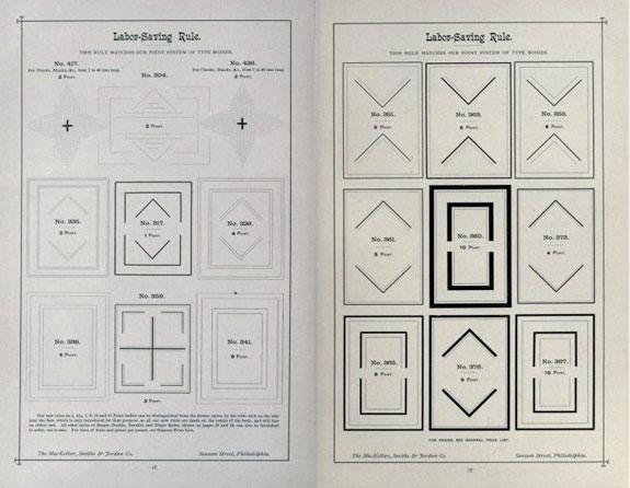
Next in line to keep the craze rolling were the typefounders, anxious to supply the myriad range of sorts which were added to the rule-bending for more artistic effect. The firm of MacKellar, Smiths & Jordan stated that, “at no time since the invention of their art have printers been so fully supplied as at present with typographic implements for producing exact and beautiful work. . . . Among late novelties are several beautiful series of ingenious adjustable characters for the ornamentation of display lines, both straight and elliptical.”
At about the time that even the most versatile comps could do more than produce what everyone else was doing, the trend shift—away from the curves and the bends to panels and angles. This practice became even more widespread than the bending, as, to be fully effective, the panels had to be intricately intertwined with one another throughout the job being composed, were it a title page or a full-page advertisement.